
SpecEase
An educational app that identifies and tracks endangered animals in users' areas and connects them with resources to contribute conservation efforts.
Dan Hubsher
Lead UX Designer
Sep. 2024-Jan. 2025
User Research
Concept Ideation
Wireframes & Mockups
Prototyping
Usability Testing

Navigate by section
People care about endangered species but it feels like such a big, far away problem.
The goal; make conservation a local issue by allowing users to learn about endangered species in their area and connecting them with others interested in wildlife preservation.
Research
User Interviews
One-on-one interviews were conducted focusing on how people engage with the idea of conservation and what effect technology could have on the issue. These sessions revealed two major pain points:
1 /
Wildlife extinction is such a vast problem that the average person feels helpless to do anything.
2 /
The term "endangered species" is often associated with "exotic" animals like tigers and pandas that most people don't have any interactions with.


Concepts

Wireframes
Sketches


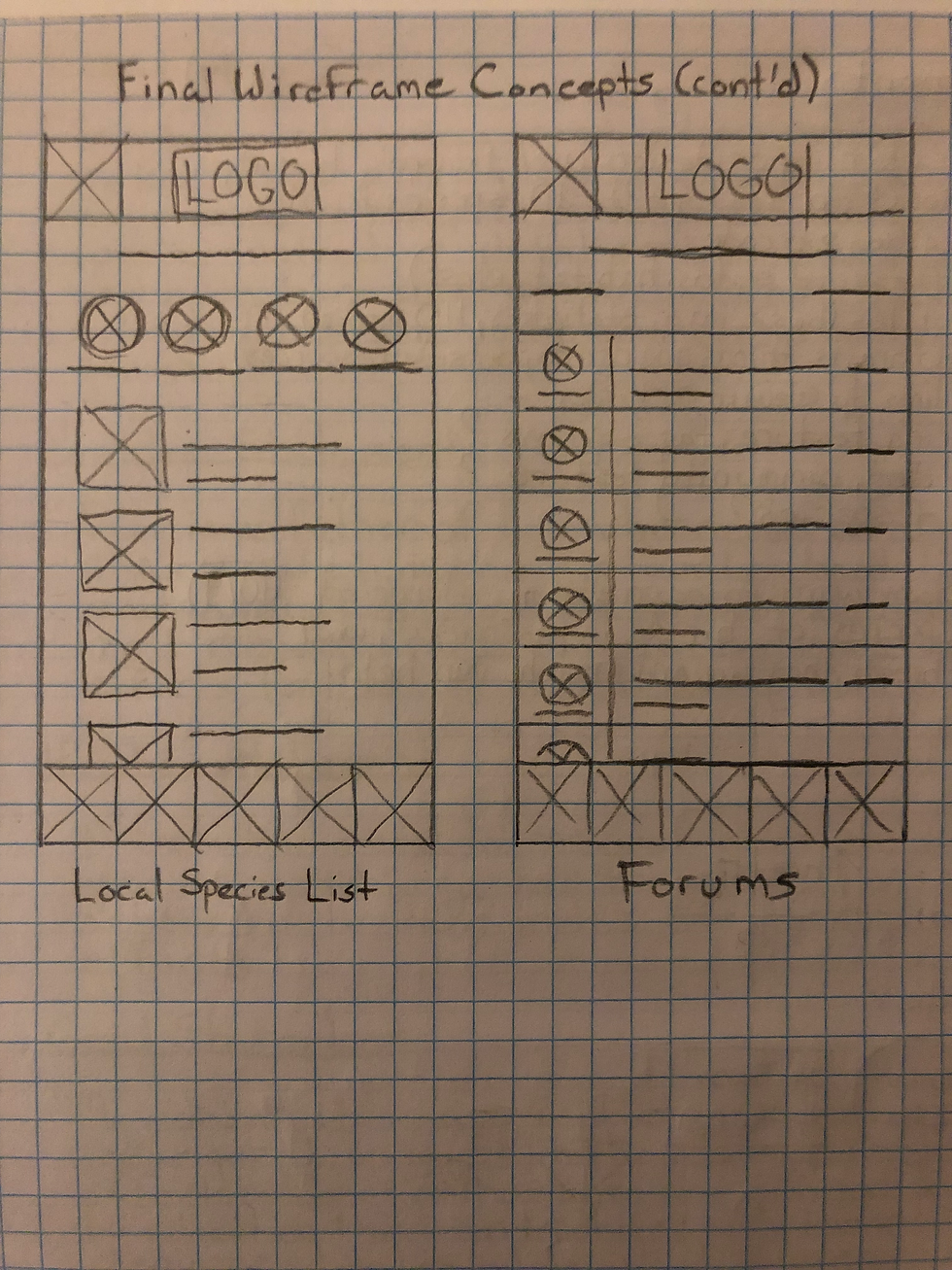
A series of rough sketches were drawn up for the various page layouts. Eventually the best features were consolidated into a single design.
Digital


Using Figma the layout was then further refined and developed. Placeholders were used for images and text as the focus was on preparing the design for prototyping.
Usability Test I
The digital wireframes were linked together to create a low-fidelity prototype for the first round of usability testing.
1 / News Page Layout
Some users confused the News Page and the Community Page, before quickly realizing their mistake. The two layouts looked very similar.
This problem was solved by redesigning the News Page with a "card" layout similar to Apple's News app.

Before

After
2 / Alternate Path to Species Profile
Some participants took an alternate user path to get to the Species Profile, either using the Sightings Map or skipping the Full List and immediately clicking on Birds.
This wasn't necessarily a problem as long as all the elements were properly linked up. Multiple user paths to complete a single task can help increase overall usability. The Full List and Sightings Map options could be used for casual browsing.
3 / Trouble Finding the Sightings Map
Some participants had trouble finding the Sightings Map, either struggling a little before completing the task or skipping it entirely.
This was determined to be a "lo-fi" problem. The wireframes had no images or symbols to help navigation. On top of that the instructions specifically used the word "map" and the layout didn't. This was a mistake on my end that was remedied moving forward.

Design System
With the layout solidified it was now time to fully flesh out the app with color, text, images and icons. This meant building a design system to provide easy access to all the used elements and ensure consistency and continuity throughout the app.
Color Scheme
Note: The initial color scheme had to be changed to the final one presented here to better meet WCAG standards. Some early mockups will reflect this.


Most navigation icons were from Apple's SF Symbols 6, a feature of Apple Design Resources.
Icons for the Species List were from Iconshock's Free Animal Material Icons set and adapted to fit the color scheme of the app.
The threat icons and status designation icons were designed by yours truly!
Icons
In order to make navigation as easy as possible icons were chosen for their simplicity and clarity.
Images
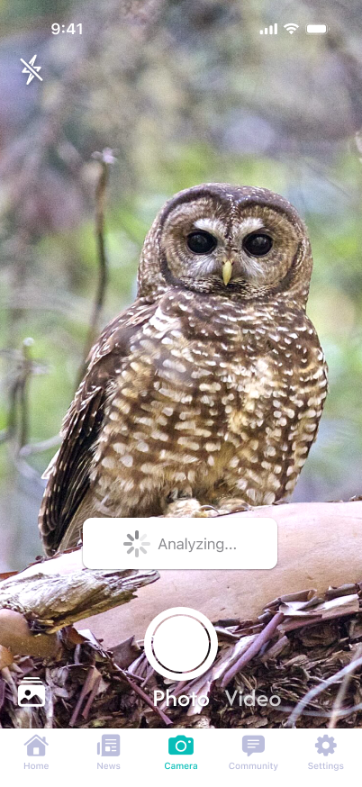
Of course no app is complete without images. One of the main draws of a wildlife app is high quality photographs of the animals users are trying to protect.


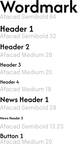
Fonts
Fonts and typefaces were chosen to ensure legibility and reinforce information hierarchy.
Afacad was chosen for larger text such as section headers and buttons.
For body text and captions Barlow was used. And SF Pro was used for standard iPhone text information.


Mockups
Initial Mockups
Utilizing the elements created for the design system, mockups were built on the foundation provided by the wireframes.


Usability Test II
For the second round of usability testing the mockups were linked together to create a high-fidelity prototype.
Insights
1 / Intro Page Options
Some users expressed that they would prefer a GPS-linked Use My Location function in the Intro Page instead of the Choose Your State drop-down menu.
This issue was addressed by adding Use My Location as an option, while still keeping the drop-down menu.

Before

After
2 / Use of Sightings Map
On a related matter, some users suggested the Sightings Map should have a broader use. Instead of only using it to find one species, allow the user to view all reported sightings around them, incorporating the GPS.
Automatically showing every sighting all at once might be a bit too much for every user, so a See All toggle was added to give them the option. Additionally, a GPS beacon was added to the map to represent the user's location relative to reported sightings.

3 / C2A
It became apparent that a more definitive Call-to-Action was needed in order to give the user flow more drive and purpose.
So an Adoption Feature was added, marked by an attention-grabbing button in the Species Profile.


Final Prototype
High Fidelity Prototype
The changes from the insights were implemented. Screen designs and user flows were modified accordingly. As mentioned earlier, the color scheme was changed to better comply with WCAG Standards for readability. Finally, some basic animations were added to give the user a more dynamic experience.
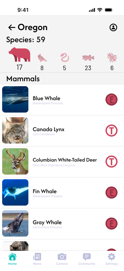
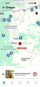
Note: The only state available is Oregon and the only species available is the Northern Spotted Owl.
Accessibility
Accessibility is always a prime concern in app design. The color scheme was changed to meet WCAG standards. Sans-serif fonts were used because they're easier for people with reading disabilities. Additionally, the app will have multiple language options and compatibility with switch devices.
Next Steps
Thank You!
For more information please email me